Click "Pie"
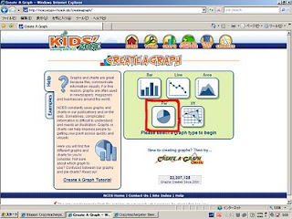
Click "Data"

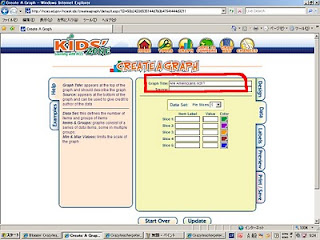
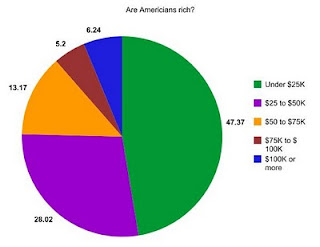
Enter the title of your graph.
my title is "Are Americians rich?"
Next, do research!
I used Wikipedia.
http://en.wikipedia.org/wiki/Personal_income_in_the_United_States
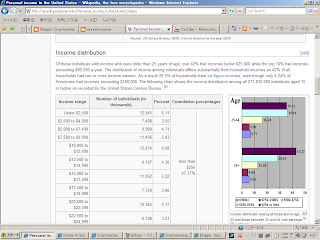
I found out this information.
Income of Americians
Under $25,000: 47.37%
$25,000 to $50,000: 75.39%
$50,000 to $75,000: 13.17%
$75,000 to $100,000: 5.20%
$100,000 or more: 6.24%
I enter this information into this website.
Then click "Preview"
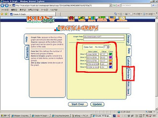
Look at your graph.
If it is ok, click "PRINT/SAVE"
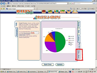
Click "Download"

Select "JPG" then click "download"

Now you can save the to your computer and put it into your blog!
4 comments:
Force it to a difficulty very much; ...
・This graph is a wonderful graph!
・Does it appear to the graph in connection with the graph and President Obama of a pie?
・I would like to come to eat, when the graph of a pie is seen also in this.
・As for President Obama, the President term of office will come soon!
・I would like to do my best so that I can also make such a graph.
It is interesting contents.
An animal is very pretty.
It is interesting contents.
An animal is very pretty.
Post a Comment